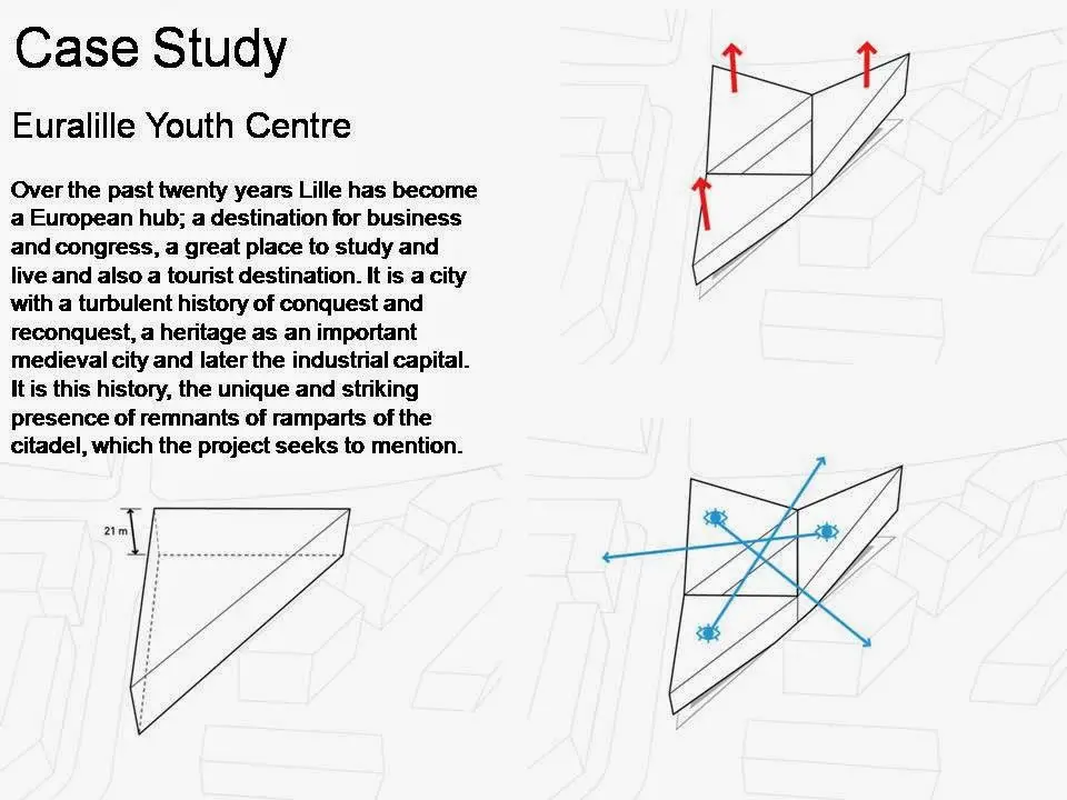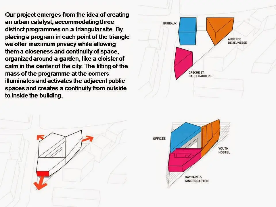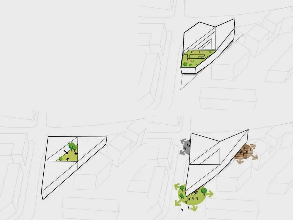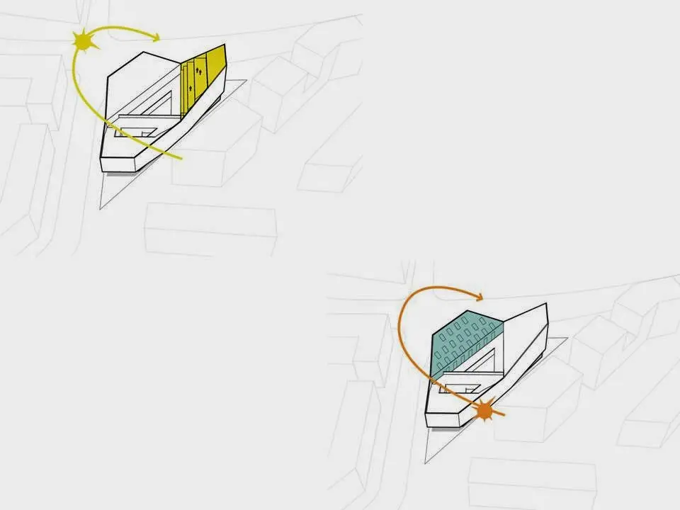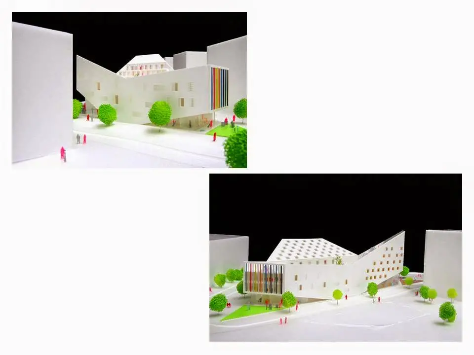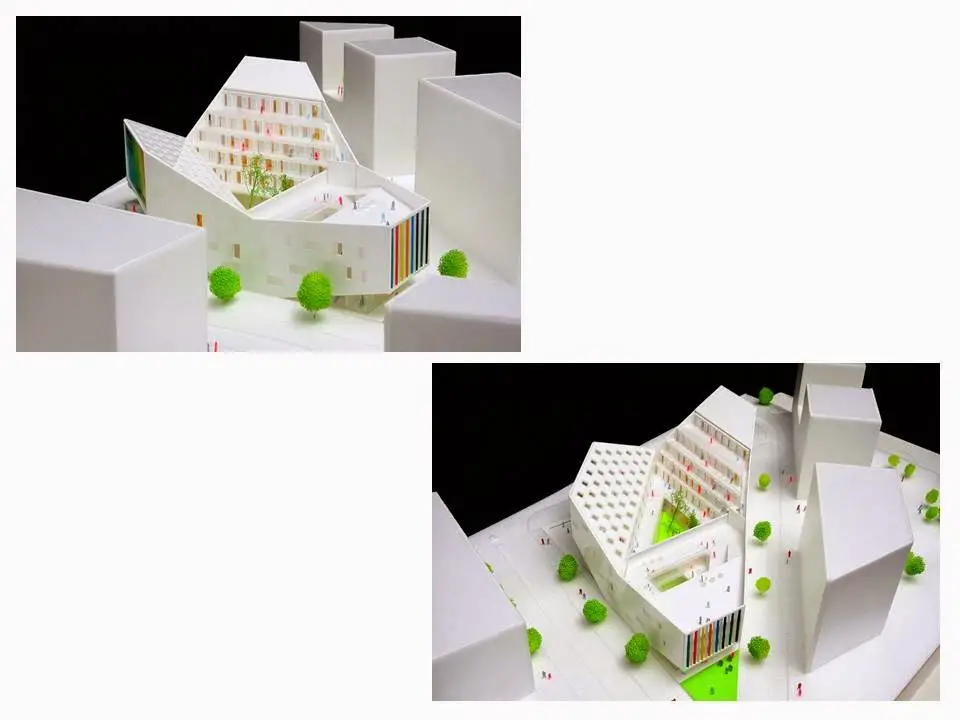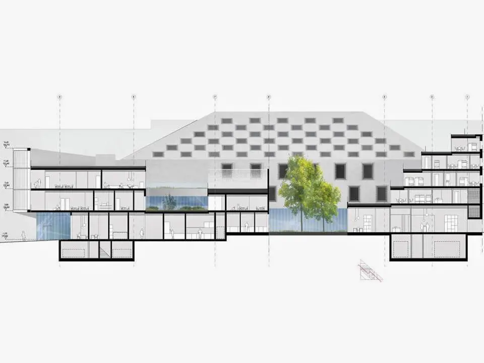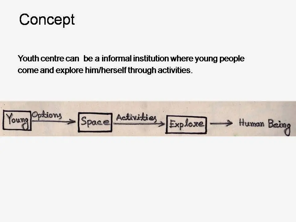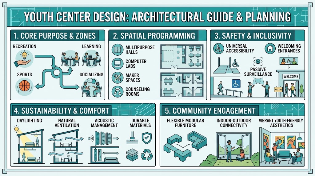
Quick answer: A youth center succeeds when its architecture solves a problem most civic buildings never face — that teenagers choose whether to walk through the door, every single day, with no obligation forcing them back. That single fact governs everything: the plan has to read as theirs rather than institutional, it has to flex between a dozen unrelated activities on the same floor area, and it has to balance visibility for safety against the privacy young people genuinely need. Get those three things right and attendance follows. Get them wrong and the building sits empty no matter how well it was funded.
That is the core of it. The rest of this guide works through the eight design decisions that separate a thriving youth center from an expensive, underused civic box.
Why Youth Center Design Is a Different Problem Than It Looks
Most public buildings are designed for people who have to be there — students enrolled in a school, patients booked into a clinic, staff rostered onto a shift. A youth center has almost none of that structural obligation. Teenagers attend voluntarily, compare it constantly against staying home, a friend’s house, a mall, or simply the street, and abandon it fast if it feels wrong.
This changes the design brief in a way clients often miss at the outset. A youth center is closer in spirit to what the sociologist Ray Oldenburg called a third place than to a school or a clinic — a space distinct from home and from any obligated setting, entered freely, where informal association is the entire point. Oldenburg’s research found that the value of such spaces comes from regulars who return voluntarily because the place feels like theirs, not because a schedule requires them there. A youth center that fails to earn that voluntary return has, by definition, failed at its core function regardless of how complete its programme looks on paper.
The architectural consequence is that every decision below gets tested against one question the design team should ask out loud in every review: would a teenager choose to come back here next week if nobody made them?
Rule 1: Design the Threshold Before You Design Anything Else
The first thirty seconds inside the door decide more about a youth center’s success than any programme decision made afterward. Teenagers are unusually sensitive to institutional cues — fluorescent-lit corridors, reception desks behind glass, signage that reads like a hospital or a school office — and any of these can read as “adult space I am tolerated in” rather than “space that is mine.”
Developmental psychology gives this sensitivity a name. Child psychologist David Elkind’s theory of adolescent egocentrism, and its component he called the imaginary audience, describes how adolescents commonly feel they are under constant observation and judgement by the people around them. A youth center entry that puts a visitor on display in front of a staffed desk before they have had a chance to orient themselves works directly against this heightened self-consciousness, which is exactly the wrong first impression for a building trying to earn a voluntary return visit.
A strong entry sequence instead does three things. It puts something alive in view immediately — activity, colour, a glimpse of a games area or a group of peers — rather than an empty lobby. It sets any welcome point to the side of the natural walking line rather than positioning it as a barrier a visitor must pass through and be seen by. And it lets a visitor read enough of the building’s layout from the entry to orient themselves without asking, because asking an adult for directions is itself a small social cost a nervous first-time visitor may not want to pay.
Rule 2: One Flexible Hall Beats Six Fixed Rooms
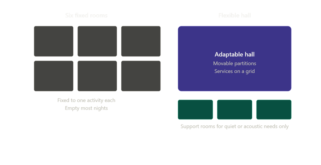
Youth center budgets rarely support a dedicated room for every activity a needs assessment surfaces — music, gaming, art, dance, tutoring, cooking, quiet study, group meetings. The traditional response, one small room per activity, produces a building where most rooms sit empty most nights because interest in any single activity fluctuates with trends, seasons and the specific cohort of young people currently attending.
The more resilient answer is a large, adaptable central hall — movable partitions, retractable seating, a resilient floor finish, power and data distributed on a grid rather than at fixed points — surrounded by a small number of smaller support rooms for activities that genuinely need acoustic or visual separation: recording or music practice, tutoring requiring quiet, and any room used for counselling or sensitive conversations.
This single design choice does more for long-term utilisation than any other decision in youth center architecture, because it lets the building’s programme evolve with the interests of whoever is currently walking through the door, rather than locking the space into whatever was popular during the design phase.
Rule 3: Sightlines Have to Serve Safety and Privacy at the Same Time
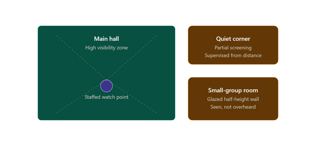
Youth centers carry a genuine duty of care, and staff need clear sightlines across active areas for safety and safeguarding reasons. This is essentially the same principle urban planners use to design safer public space: Crime Prevention Through Environmental Design (CPTED) treats natural surveillance — arranging physical features, activities and people so that visibility is maximised without a guard standing over anyone — as one of its central strategies, and it applies inside a youth center just as it applies to a public square.
But total visual exposure is precisely what drives some teenagers away — adolescence is a period of intense self-consciousness, and a space where every corner is visible to every adult in the building can feel more like surveillance than care. The resolution is zoning by degree of openness rather than choosing one extreme. High-visibility zones — the main activity hall, games areas, general hangout space — should have generous sightlines from a staffed point without requiring staff to stand over participants. Lower-visibility zones — quiet corners, a reading nook, small-group spaces — can use partial screening, planting, level changes or furniture arrangement to create a sense of retreat while staff retain a supervised line of sight from a distance, not a hovering presence up close.
Glazed or half-height partitions between the hall and smaller rooms achieve both goals simultaneously: a staff member can see that a room is occupied and that nothing concerning is happening, without being able to overhear or fully observe what’s being discussed inside.
Rule 4: Acoustic Separation Is Not Optional, and It Is Cheap to Get Wrong
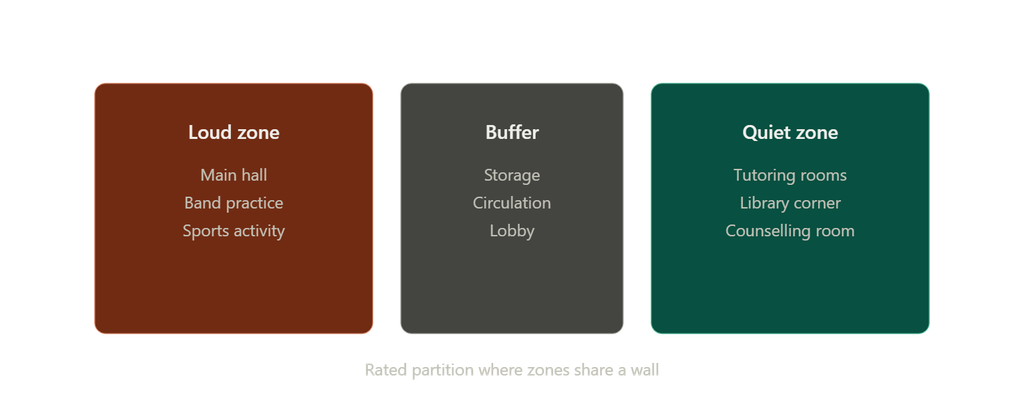
A youth center routinely runs a loud group activity, a quiet tutoring session and a counselling conversation simultaneously, often within metres of each other. Acoustic separation between these zones is not a finishing touch; it is a programme requirement that has to be resolved in the section, not patched with a wall-mounted panel afterward.
Practical acoustic zoning for youth center design groups spaces by noise generation rather than by function alone: the main hall, music or band practice, and any sports or physical activity space sit together on one side of the plan, ideally with a buffer zone — storage, circulation, a lobby — between them and quiet-use spaces such as tutoring rooms, a library corner, or any room used for one-to-one conversations. Where a loud and a quiet space must share a wall, specify the partition by its sound transmission class rating from the outset, because retrofitting sound isolation into a stud wall after a youth center opens and staff discover tutoring sessions can hear the band room is a common and entirely avoidable expense.
Rule 5: Bring the Outside In, Deliberately
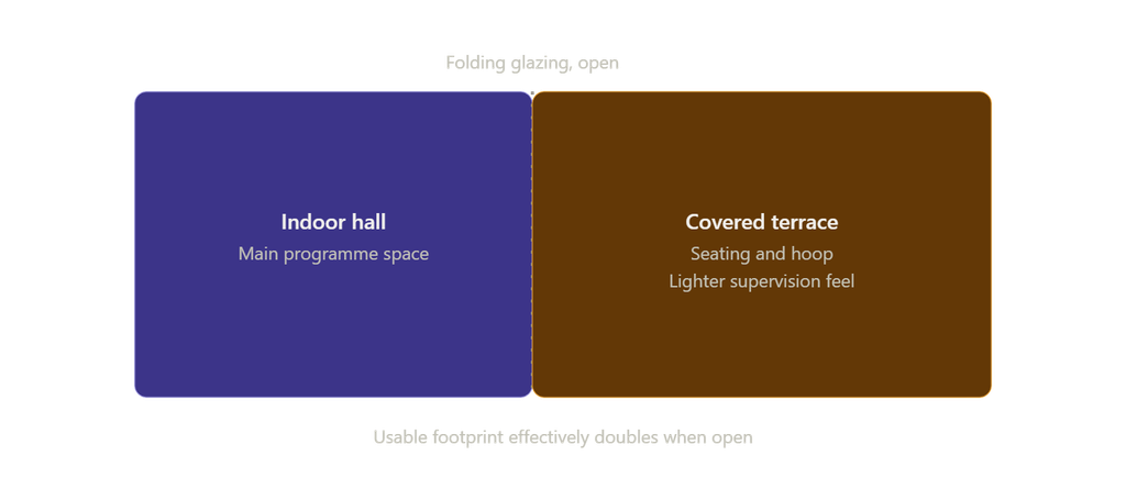
Outdoor space is disproportionately valuable in youth center design, and disproportionately underused in youth center construction, usually because it gets treated as landscaping rather than as programmed space.
A covered outdoor area — a courtyard, a sheltered terrace, a roof deck — extends usable floor area at a fraction of the cost of enclosed building, and it offers something an indoor hall cannot: informal space where the presence of adult supervision feels lighter, which matters enormously to older teenagers in particular. The wider case for this connection is well established in biophilic design research, which links access to daylight, greenery and outdoor views with measurable improvements in mood and wellbeing — benefits that apply just as strongly to a room full of teenagers as to any other building occupant.
Basketball hoops, seating that supports both organised sport and unstructured hanging out, and direct sightlines back into the building from staffed indoor zones all belong in this outdoor programme, not as an afterthought once the indoor budget is spent. Where climate allows, sliding or folding glazing between the main hall and an outdoor terrace effectively doubles the usable footprint of the largest room in the building on the days it matters most.
Rule 6: Colour and Material Choices Signal Who the Building Is For
Institutional finish palettes — pale walls, commercial vinyl flooring, ceiling-mounted fluorescent strips — are chosen for durability and cost, and they are also the fastest way to make a youth center read as an extension of school rather than an escape from it.
This does not mean an unrestrained palette with no coherence. It means a deliberate material and colour strategy that reads as considered and current rather than institutionally neutral: warmer light temperatures, accent colour used with intent rather than by default, durable but visually engaging flooring, and finish choices that can be refreshed relatively cheaply as trends and cohorts change, since a youth center’s aesthetic has a shorter useful life than its structure. Involving actual teenage users in material and colour selection during design development is standard good practice in youth facility projects and consistently produces better attendance outcomes than a designer’s assumption of what “feels young.”
Rule 7: Build In Genuine Flexibility for Ownership and Identity
Beyond adaptable furniture, a resilient youth center gives its regular users some capacity to shape the space themselves — a wall intended for changing artwork or murals, noticeboards under participant rather than staff control, or a room that different groups can claim and personalise on a rotating basis.
This matters because a sense of belonging drives return visits far more reliably than programme variety alone. Environmental psychologists studying territoriality and sense of place have found that people invest more in, and return more often to, spaces that visibly carry evidence of the people who use them. A space bearing the marks of past events, decoration and personalisation reads as belonging to its users in a way a freshly painted, permanently neutral room never will, however well equipped it is.
Design this in physically: a section of wall finished for regular repainting or pinning rather than a precious finish that discourages any mark-making, and storage that lets a group’s belongings and projects persist between sessions rather than requiring everything to be cleared and reset each time.
Rule 8: Plan for the Building to Change Faster Than Expected
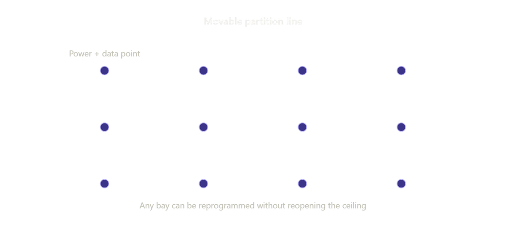
A youth center’s programme will shift substantially within a few years of opening, driven by changing interests among the young people using it, funding cycles, and staff turnover. Buildings designed around a single fixed programme age quickly and expensively; buildings designed around infrastructure that can be reprogrammed age well.
The practical version of this rule: run services — power, data, ventilation — on a grid rather than to fixed points, so a room’s function can change without reopening the ceiling. Specify movable rather than built-in furniture wherever the function of a space might plausibly change. And where budget allows, oversize a small number of structural bays rather than building every room to its exact current programme, so a wall can move later without a structural engineer’s involvement.
This is the same lesson the site’s fitness-centre case study reaches from the opposite direction — the article on fitness centre design and its nine proven rules makes the same argument for adaptable zoning in a different building type, which is worth reading alongside this one if the youth center brief includes any fitness or active-recreation component, as many now do.
Common Youth Center Design Mistakes to Avoid
- Leading with a staffed reception desk as a barrier. It reads as institutional gatekeeping before a visitor has taken three steps inside.
- Building six small fixed-purpose rooms instead of one adaptable hall. Interest shifts faster than construction; flexibility outlasts any single programme guess.
- Choosing total visual openness for safety and calling it done. Some privacy is necessary for teenagers to actually use the space.
- Treating acoustic separation as a finishing touch. Loud and quiet activities sharing a thin wall is a recurring, avoidable complaint.
- Leaving outdoor space unprogrammed. It is the cheapest square footage in the project and often the most used once summer arrives.
- Defaulting to an institutional finish palette for durability alone. Durability and an engaging, current aesthetic are not mutually exclusive.
- Designing without asking the actual users. Adult assumptions about what teenagers want are frequently wrong and easily tested.
- Fixing every room to its opening-day programme. The building will need to change faster than the funding cycle that built it.
A Practical Youth Center Design Checklist
- Walk the entry sequence as a nervous first-time teenage visitor would and remove every institutional cue you find.
- Replace fixed single-purpose rooms with one large adaptable hall and a small number of acoustically separated support rooms.
- Zone sightlines by activity, giving high-visibility supervision to open areas and partial privacy to quiet or sensitive spaces.
- Group loud and quiet activities on opposite sides of the plan and specify acoustic separation at the section stage, not after complaints arise.
- Programme a covered outdoor area with the same seriousness as the indoor hall, including direct sightlines back into the building.
- Choose colour and material finishes with input from actual teenage users, and budget for periodic refresh rather than permanence.
- Build in physical space for participant-driven identity — changeable wall surfaces, group-controlled storage, rotating room claims.
- Run services on a flexible grid and specify movable furniture so the building can be reprogrammed without major construction.
Practices developing a youth center brief can review the studio’s approach on the project portfolio or the services page.
Frequently Asked Questions
What makes youth center design different from other community buildings?
Attendance is entirely voluntary and repeated daily, so the architecture has to compete for a teenager’s time against every other option they have, closer to Oldenburg’s idea of a chosen third place than to a school or clinic people are obligated to attend.
How much flexible space does a youth center need?
As much as the budget allows, prioritised over fixed single-purpose rooms. A large adaptable central hall with movable partitions typically serves changing interests better than several small dedicated rooms.
How do you balance safety and privacy in a youth center?
Zone the building by openness rather than choosing one extreme throughout — clear natural-surveillance sightlines in active shared areas, with partial screening and distance-supervised privacy in quiet or sensitive spaces.
Does outdoor space matter for a youth center?
Significantly. A covered outdoor area extends usable space cheaply and offers a lighter-supervision environment that older teenagers in particular respond to, consistent with the wellbeing benefits documented in biophilic design research.
Should teenagers be involved in the design process?
Yes. Direct input on colour, material and layout decisions consistently produces better attendance and satisfaction outcomes than design based on adult assumptions alone.
How do you keep a youth center relevant over time?
Design the infrastructure — services, partitions, furniture — to be reconfigured easily, since the programme will shift faster than the building’s structural lifespan.
Conclusion
A youth center is judged nightly by people who are free to leave, and its architecture either earns their return or does not. Get the threshold right, build genuine flexibility into the plan instead of fixed rooms, balance visibility with privacy, separate noise at the section stage, and treat outdoor space and material choices as seriously as the main hall. Do that, and the building will keep pace with whoever walks through its door next, whatever they turn out to want.
Related Content From architectureassociate.com
- Fitness Centre Design: 9 Proven Rules from the Physical Fitness Centre Case Study
- Salk Institute Louis Kahn: 7 Timeless Design Secrets Behind the World’s Most Inspiring Laboratory
- Auditorium Design Standards: 7 Bold Rules to Know
- Browse the full Education category
- Browse the full Physical Fitness Center category